- S&P is At Risk of Forming a Double-Top
- The 3Mth/10Yr Yield Curve is Still Inverted
- Jobs Growth is Slowing but is Still Solid
- Norwood Economics is Always Willing to Discuss Performance
Market Update
The S&P 500 fell 4.3% last week to finish at 5,408.42. The Nasdaq 100 lost 5.9%. The equal weight S&P 500 (RSP) lost 3.1%. It easily outperformed the market cap-weighted S&P. It has also outperformed the market cap-weighted S&P over the last two months by 7%. The equal weight S&P set a record high a week ago Friday. The S&P set its last record high on 16 July. The Nasdaq 100 set its last record high on 10 July.
The mega caps that have led the market since 2023 have been underperforming over the last few months.
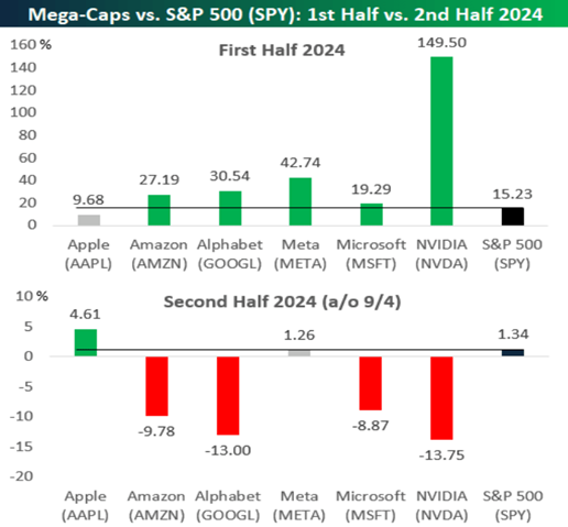
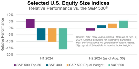
The stock market rally has broadened, which is a good thing. The S&P 500 largest 50 outperformed the S&P 500 in the first half (see chart below). The S&P 400 Midcap Index, Equal Weight index, and S&P 600 small cap index all underperformed the S&P in the first half. They are all outperforming the S&P 500 in the second half. The S&P 600 small cap index trailed the S&P by a whopping 16% in the first half. It outpaced the S&P 500 by around 6% in the first two months of the third quarter.
We wrote last week that, “The odds favor a continuation of the rally after some more consolidation. We may get a 3% to 5% pullback in September, but any sustained down move is unlikely, at least until negative economic news arrives.”
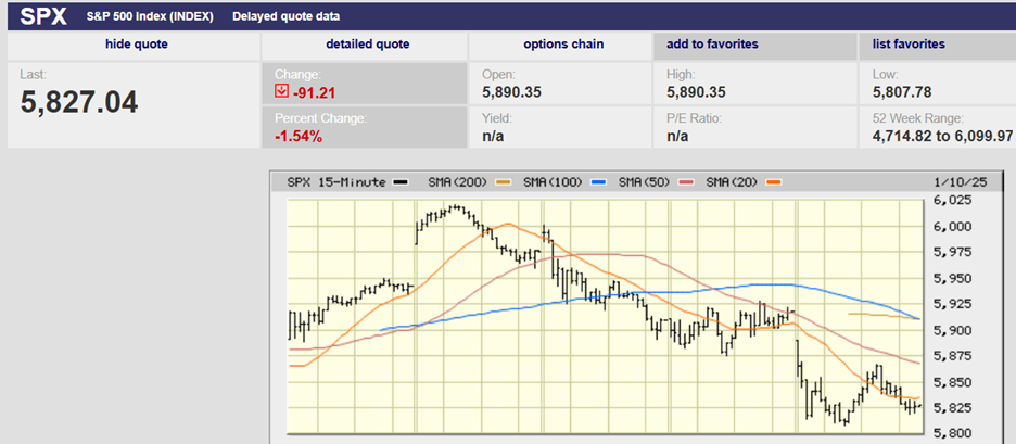
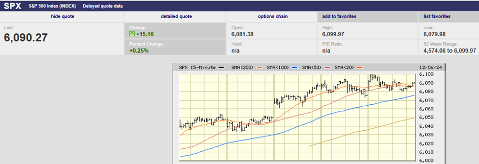
It appears the pullback has arrived. Whoever spiked the market last Friday in the last 30 minutes of trading was positioning for an up open after Labor Day. They would have wanted to clear resistance in the 5,640-52 area, which they failed to do. The S&P closed at 5,648.4.
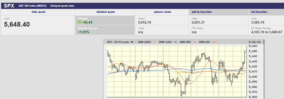
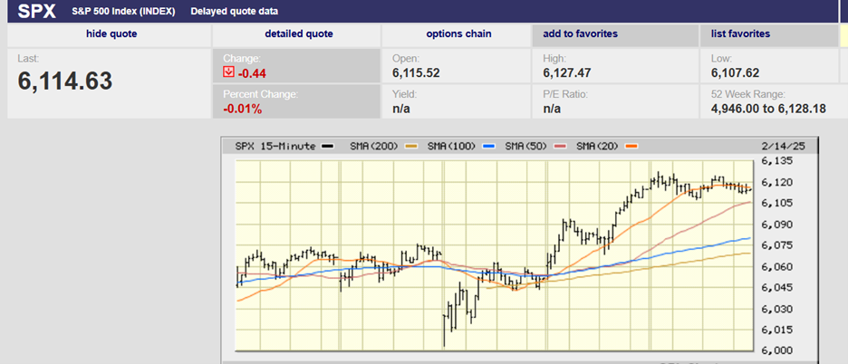
Five-Day Chart from one week ago
They would have hoped to take out the July 16th high at 5,669.67 in early trading on Tuesday. They didn’t get the up open let alone a new record high. The S&P gapped down to 5,623.89 at the open Tuesday, reversing the 15-minute spike higher from the prior Friday. It was a straight down day Tuesday. The high for the day was set at the open.
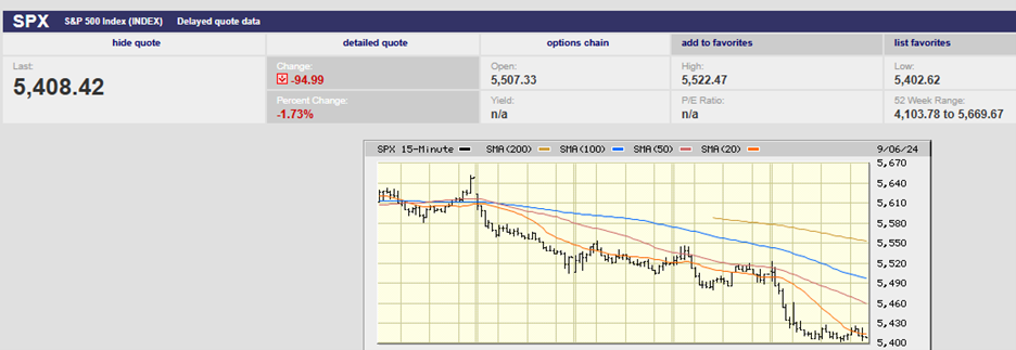
The S&P attempted a rally Wednesday but couldn’t get above 5,552.99. The index hit that number at 11 a.m. only to have selling return, knocking the S&P down to 5,503.66, the low for the day. The index bottomed at 5,504.33 on Tuesday. An up open on Thursday managed to push as high as 5,546.30 before investors started selling once again. The S&P fell to 5,480.54 by around noon. It closed at 5,503.41. The low for the day on Wednesday was 5,503.66. The S&P bottomed at 5,504.33 on Tuesday. It closed on Thursday at 5,503.41. A contested area at 5,503-04 and one to watch later today (It’s 2:34 on a Friday).
Currently, the S&P is at 5,403 down 1.82% on the day. The index has traded sideways since finding support at 5,404.47. The 100-day moving average is 5,390. We are likely to see one of three scenarios play out in the next hour and 24 minutes. Buyers could spike the market back to the 5,503-04 level. The market could trade sideways above 5,400 and the 100-day, which is at 5,390. The S&P could break support (5,400 and the 100-day) and finish the day down 3% or more. We’ll have to wait and see which scenario plays out.
(Turns out it was scenario two. The S&P tried to rally Friday afternoon. The first attempt came at 1 p.m. as the index climbed from 5404 to 5,425 by 1:30. Selling pushed it back to 5404 by 2:30. Buyers tried again at 3 p.m. They pushed the index back to 5,425 by 3:15 p.m. Sellers came in again and knocked the index back to 5,404 again. Stand-off.)
The VIX closed at 22.38. The Fear Gauge isn't showing enough fear. There is probably more selling ahead. A reading in the mid-30s or higher will signal a short to medium-term bottom. Until then expect the S&P to trade lower.
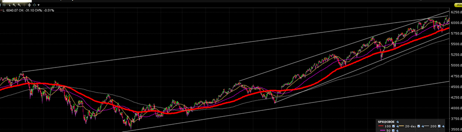
Longer term, the S&P is at risk of forming a double top. A negative development that would encourage traders to sell to lock in profits. It would also encourage short-sellers to increase their downside bets. The index would need to break 5,119.26 for a double top. The 200-day is at 5,070. A pullback to the 200-day in an ongoing up trend would be normal. The decline from the peak of 5,669.67 would be a loss of about 9.7%, not unusual and nothing to worry about. There is support around 5,000 as well.
The S&P would trade at less than 18x 2025 earnings at 5,000. Still not cheap but moving closer to fair value. Of course, that assumes that earnings estimates for next year are close to the mark. Norwood Economics doesn’t believe they are. Estimated earnings growth of 15.2% for 2025 is aggressive. Nominal GDP growth is slowing as inflation slows. Margins are already well above the long-term average. Bond investors are expecting the Fed to lower the funds rate by as much as 2.75% by the end of 2025. There is a 70.7% chance that the fed funds rate will be at 3.00% or below according to the futures market. We can’t see a scenario in which the funds rate ends 2025 at 2.75% with earnings growing by 15%.
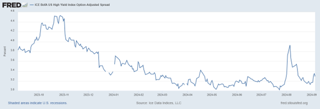
Norwood Economics believes a recession is more likely than not. We would place higher odds on a recession later this year if credit spreads were still widening. They are not. A spike earlier this year has reversed.
A recession would also be more likely if financial conditions were tight. They aren’t. Negative values in the chart below indicate looser-than-average financial conditions. The financial conditions index has been negative (loose) since 2020.
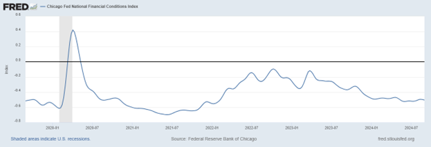
(The Chicago Fed's National Financial Conditions Index (NFCI) provides a weekly update of U.S. financial conditions. It includes money markets, debt and equity markets and the traditional and "shadow" banking systems. Positive values of the NFCI indicate financial conditions that are tighter than average. Negative values indicate financial conditions that are looser than average.)
Financial conditions have been loose for much of the last 40 years. Alan Greenspan became the Federal Reserve Chairman in 1987. The Greenspan put went into effect shortly thereafter. The Fed has followed an easy money policy ever since. Cheap money explains the record-high debt and expensive asset prices.
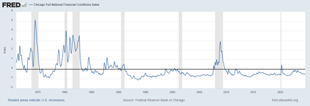
Note that recessions occurred when financial conditions were tight and/or tightening.
Still, we think a recession is coming for the reasons given in last week’s newsletter. One of those reasons was the inverted yield curve. The 3M/10Yr has called each of the last 8 recessions dating back to 1969. There have been no false positives. Recessions haven’t come while the yield curve was inverted. Rather they’ve arrived after the yield curve had normalized and was steepening.
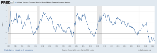
The 3Mth/10Yr yield curve is still inverted. The next recession may not arrive in our forecast window of late 2024/early 2025. It may be late next year instead. The Fed will start cutting in a few weeks. The 3Mth/10Yr yield curve will start to normalize when it does.
As for the 2Yr/10Yr, it is already normalizing. It doesn’t have quite as good a track record. It is still worth paying attention to it. Call it a warning flag.
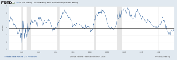
The yield curve is finally normalizing. The US 2 and 10-year yield curve turned positive last week after a record 796 days of inversion. The curve has been inverted since July 8, 2022. The July 2022-Sept 2024 curve inversion is now the longest since 1927/29. It exceeds other long inversion periods. To wit the inversions that preceded the 1973/74 and 2007/08 recessions and bear markets. The 2Yr-10Yr was steepening before the 1980s recessions (see chart above). The yield curve had normalized and was steepening for the last four recessions.
Risk is higher than normal. Risk management remains a priority.
Economic Indicators
The payrolls number was the big report last week. The August payrolls report showed 142,000 jobs added, below the 165,000 consensus. The unemployment rate fell to 4.2%. There were significant downward revisions for June and July. The jobs number for June was revised down by 61,0000 from 179,000 to 118,000. The revision for July was a drop of 25,000 from 114,000 to 89,000.
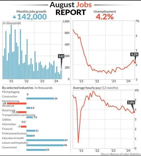
Jobs growth is slowing but is still solid. The average jobs growth for the trailing 12 months is 202,000. The 3-month average is 116,000. The fear is that the jobs market will continue to deteriorate in the coming months. There is reason to believe we will see negative prints before the year is out.
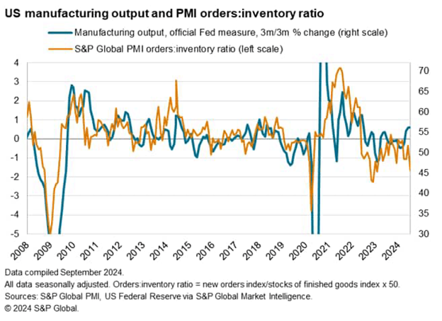
One red flag is the rise in inventories. A second red flag is the decline in new orders.
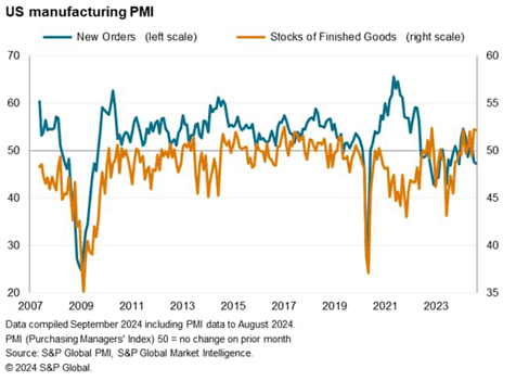
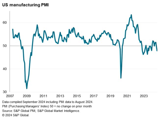
The seasonally adjusted S&P Global US Manufacturing Purchasing Managers' Index™ (PMI®) posted 47.9 in August, down from 49.6 in July. The latest reading was the lowest since last December. It was the second consecutive month of deteriorating manufacturing sector conditions.
The sub-indices of the PMI and data collected from an accompanying survey of 800 manufacturers showed that warehouse inventories are rising. The survey's Stocks of Finished Goods index has shown in recent months some of the largest inventory gains seen since data was first collected in 2007. The drop in new orders has factories cutting production for the first time since January. New orders fell in August by the most in 14 months. Export orders declined at the steepest rate in a year.
Inventory corrections are a common catalyst for recession. Business investment makes up about 15% of the U.S. economy. Business investment is also the most volatile component. Businesses reduce production and lay off workers when inventories are too high. A combination of rising inventories and falling new orders is a problem. Currently, it is the most negative indication of forward production trends in one and a half years. (See the chart below).
The economy is slowing. The jobs market is softening. Inventories are rising and new orders falling. The 2Yr/10Yr yield curve is normalizing. There are plenty of reasons to worry that the economy might fall into recession in the next few quarters. There is more than enough data to warrant Fed rate cuts. A problem is that monetary policy works with long and variable lead times. That is true both when the Fed is raising rates and cutting rates. The Fed may turn out to be late once again.
Investing, Calculating Performance
I had a conversation with a client last week about performance. They wanted the purchase dates and cost basis for the stocks in their portfolio. They wanted to calculate performance. We use Charles Schwab to custody client accounts. They have portfolio performance software that calculates performance for our clients. We can pick benchmarks and time periods, but Schwab’s software calculates the time-weighted rates (TWR) of return. We go over performance with our clients at our annual reviews. Also, whenever they ask.
The performance software considers the holding period, purchase price and dividends paid. That last is important since the 24 stocks we own have an average dividend yield of 4.38%. Dividends count toward total return. They are real and you can spend them just like you can spend capital gains once you sell a stock.
The client still wanted the dates and purchase prices of the stocks. So, we exported a spreadsheet from the Schwab platform that showed the dates purchased, purchase price, cost basis, and market value. I let them know they wouldn't be able to calculate returns with the information since there was necessary data missing.
They were missing the returns of the stocks we’d bought and sold during the five-year period. They were also missing the dividends paid by the stocks since they were purchased. It’s impossible to calculate performance without including all the stocks held during the period in question. It’s also impossible to calculate accurate returns without accounting for all the dividends paid during the period in question. I got the impression they were going to try anyway.
For the record, their stock portfolio has easily outperformed the Morgan Stanley All-Country index over both three- and five-year periods. (We use the MSACWI because 12 of the 24 stocks we’ve bought for clients are international). I haven’t run the portfolio against the S&P (apples to oranges) but expect it has handily outperformed the U.S. over those periods as well.
Calculating and understanding performance is complicated. The CFA Society has a whole course in it after which you receive a Certificate in Investment Performance Measurement (CIPM). The course takes about one year to complete.
Norwood Economics is always willing to discuss performance with clients. We’re also more than happy to benchmark portfolios managed by other advisors. We have software that can show you whether your advisor is actively managing your portfolio or stealth indexing. You shouldn’t be paying an active management fee if your advisor isn’t providing active management.
Regards,
Christopher R Norwood, CFA
Chief Market Strategist